Thursday, May 19, 2016

Business Card

For this project, we were told to create our own business card that had examples of our graphic design capabilities  I approached this by picking my favorite work I have done and then decided to pick a cool font to play with. I picked this font that made the letter look like they were hanging. I edited the text and the pictures to make it look like everything is hanging. I think this ended up looking pretty good and am happy with how this turned out.

Thursday, May 5, 2016

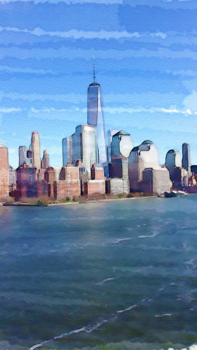
Watercolor Blue Lightning

For this project, we were told to watch tutorial that taught us how to turn photos into a watercolor looking design. I decided to use this picture of new york city that I took over spring break while on a boat. It was interesting seeing how you can combine a bunch of filters and effects to make it look like this. I am happy with how this turned out.

Monday, May 2, 2016

Self Portrait

For this project, we were told to do a type of self portrait that wasn't a selfie that represented us in some way. I choose to us illustrator for this project. I took a photo of my face and then used the pen tool and a drawing board to make my face, my hair, and my eyebrows. I then used the line tool to make a soccer ball pattern on my face. This is supposed to represent my love for soccer. When I think of who I am I almost immediately think about soccer. I like how this turned out and I enjoy this style.

Thursday, April 21, 2016

Graphic Designer Research Project

Eddie Opara
Opara was born in Wandsworth, London in 1972. He got his formal arts education from the London College of Printing and Yale University. After working for many different design firms, he created his own firm called The Map Office in 2005. Some of the people he worked for include the Studio Museum in Harlem, Architecture Research Office, the Queens Museum of Art, St. Regis Hotels, Princeton Architectural Press, Jazz at Lincoln Center and New York University among many others. In 2010 he joined the well known design firm, Pentagram. His work tends to be very modern and involves many interesting shapes. My piece is similar to that type of art. I based this design on a piece that he actually designed but he made it 3D.

Sources:
http://www.famousgraphicdesigners.org/eddie-opara
http://www.designindaba.com/profiles/eddie-opara
 Milton Glaser
Milton Glaser was born in New York City in 1929. He attended an art and music based high school and went to college at Cooper Union. In 1954 he co-founded Push Pin Studios with some fellow college graduates. He worked there for twenty years while it led much of the world in design. He won the National Medal of Arts in 2009 from Obama. His most well-known design would be his I <3 NY design that is almost universally known. I took his design and made it for Virginia. It definitely represents his work being that his NY design is his most famous.

Sources:
http://www.aiga.org/medalist-miltonglaser/
http://www.miltonglaser.com/milton/#2

Monday, April 18, 2016

Puerto Rico Picture

 For this project, we were told to take many pictures of one thing and then using photoshop place the pictures together to make a larger picture. I took my pictures while I was on vacation over spring break. This scene below is in Puerto Rico and is a cemetery by the ocean that is placed next to an old fort. I used 10 pictures to create this scene. Besides editing the brightness and contrast, all I had to do was arrange the pictures correctly. I am happy with how this turned out.

Monday, March 28, 2016

Tattoo Project

For this project, we were told to create our own tattoo. I decided to go with a simplistic looking tattoo that would be done with just black ink. I think this symbol represents the illuminati and I thought it would be funny to make it and put it on someones forehead because of how eccentric it is. I made most of the tattoo using the pen tool with the stroke function. I made the triangle using the custom shape tool. I am really happy with how this turned out, even though I would never put it on myself.


Tuesday, March 22, 2016

Batesville Day Parade

For this project, we were told to create a T-shirt design for the annual Batesville day parade that happens near our school. We were told to make a design featuring some musical aspect because the feature of the parade this year is the Henley marching band. They also wanted us to put the design on a shirt so that they could see how it would look. I created a simplistic and clean design. I am happy with how this turned out and wish I hadn't been sick so I could've been in contention for the contest.

Thursday, February 25, 2016

ACPS Visual Arts Festival 2016 Poster

For this project, we were told to create a poster for the upcoming ACPS Visual Arts Festival. This festival shows off the art of kids that go to ACPS schools. I decided to go with a simplistic design that gets the information across easily but still looks nice. I used the pen tool to create the wavy looking title. I added an outer glow to the example picture to help separate it from the poster. I also made sure to make the ACPS logo big enough so people could see it. I am happy with how this turned out.

Thursday, February 18, 2016

Life of Pi Project

For this project, we watched the movie, The Life of Pi, and were told to make two pieces of art inspired by the movie. When I watched the movie I found that the tiger seemed to be a main part of the story. I decided to do both of my pieces with the tiger. I used Illustrator and a drawing pad for my first piece. I used a picture from the movie to help with the drawing. This was really fun for me because I am really bad at drawing on paper but it's a lot easier on a computer. I made a cover for the movie as my second piece. I actually used my drawing in it. I tried to make it look like the tiger scratched the cover and wrote the title.


Tuesday, January 12, 2016

Midterm

Our midterm was to create a food marketing picture for Charlottesville. My concept was to create a literal corner to represent the corner/downtown. I then filled this corner with my favorite restaurants that are on the corner and downtown. I tried to get the brick texture that I used to look like the brick on the downtown mall. I really tried to make it look as realistic as possible and had to use the warp tool a lot. I'm happy with how it turned out.

Thursday, January 7, 2016

Utensils, Numbers, and Tools Project

In this project we were assigned to take many pictures of tools, utensils, or numbers and pick our top 10 to show. I took these photos in school. I challenged myself to take them in only one hall (the hall outside of the classroom). I enjoyed this project because it shows how you can turn simple things into art by just changing the perspective. I found that adding blur to many of these images changed them greatly. 


Monday, January 4, 2016

Five Minute Walk

We were assigned to go on a five minute (or so) walk around some place new and take as many photos as we wanted. Then we had to arrange our favorite pictures in a collage. I did my five minute walk on my vacation in the US Virgin Islands. More specifically  I did it at the Baths at Virgin Gorda. This national park is beautiful. I edited each of these photos in some way, whether it was just tweaking the lighting, saturation, levels or making it black and white. I really enjoyed this project because it brings back memories of my vacation. I used my Iphone 5 camera for the photos.

Tuesday, December 15, 2015

Wrapping Paper

Our project was to design our own wrapping paper and then add it onto a box to make it look 3D. I chose to do a soccer themed wrapping paper because I like soccer. Making the actual wrapping paper wasn't too hard because you could use the pattern feature in photoshop. The hardest part of this project was adding it to a box to make it look realistic and 3D. I had to use the warp tool and I couldn't find a way to keep the warp uniform to make it look realistic. Being honest, I didn't enjoy this project because I got really annoyed about how hard it was to make the wrapped box look realistic. 

Thursday, December 10, 2015

Illustrator Car

This was the first time I messed around with adobe illustrator. I found illustrator pretty straight forward and actually like it a lot more for graphics. I used the pen tool to make this car. I have used the pen tool in Photoshop many times so I was pretty used to using it. This car is a Lexus LFA. I made an LFA because it's one of my dream cars. To make the car, I imported a photo of the car and traced it with the pen tool. After sketching it, I turned it into a live paint and used the live paint bucket to color the car. I had the most trouble with making the rims of the wheel. I tried my best to make it look realistic.

Monday, November 30, 2015

Gif it Up

This project was made for a contest given by our library teacher. The contest asked people to make gifs out of free to use, non-copyrighted pictures. I used this picture because I thought this guy looked cool. I had lots of trouble getting this gif to work because it would keep going transparent and disappearing but I finally got it to work out as best possible.

Thursday, November 19, 2015

Old 'n New Photos

For this project, I was allowed to pick any tutorial on the NAPP site to attempt. I had a choice between that or making holiday cards but I decided to pick the tutorials because I prefer to work with actual photos. The tutorial was given by Dave Cross. I watched the beginning of the tutorial but it wasn't too hard to figure out so I just added my own touch to it. The premise of the idea was a contest where people would try and find the locations where old pictures were taken and line them up. I picked a street in venice for this because it has a nice old feel to it. I found a picture of someone holding a card, overlaid it, and put some of the picture over it. Then, I added some effects to make it look older. I am really happy with how this turned it out.

Thursday, November 12, 2015

Money Redesign

For this project, we were assigned to make our own type of money. You could either redesign a currency thats already around or you could completely create your own. I chose to make my own money. I decided to make money based on rappers. I chose Biggie Smalls and Kanye West. For each rapper I included the city they were born in the background. I also put their music label logo for extra "hologram" looking effect. On the back of the money I put a majority of their albums. I really like how these turned out and I wish this is what the United States currency actually looked like.


Tuesday, October 13, 2015

Westside Logo

This is my logo design for the newly created westside market at western. I tried to go for a more modern and clean design. I found the font that I wanted on dafont.com and then edited the text to make it more interesting  I am happy with the way this turned out. It would be an honor for the westside market to use my logo.

Thursday, October 8, 2015

Jicane

This project meant a lot to me. We were given pictures of orphans in Madagascar and told to edit them in a way to make them special. I picked Jicane because looked extremely happy. I had to first try my best to edit out some of the glare on his face  but after that I focused on making it personal for me. I was told that his favorite color is blue so I decided to put him in a field with blue flowers. I felt this both matched his happiness and his favorite color. I am really happy about how this turned out and I hope Jicane likes it.

Thursday, September 24, 2015

Poster Project

For this project, we were told to use concepts of design to create posters for whatever we wanted. I made a poster for the football season and a new album that Mac Miller just came out with, called Go:od AM. For the football poster, I found a picture of someone on the team and edited it onto a smoke background for a cool effect. I added their motto, "Defend the Den." I focused on creating a symbol of perseverance through a simplistic design. I added our school colors to the text to facilitate the school spirit. For my Mac Miller poster, I focused on created a simplistic design because the album cover is extremely simple. I made the background by created lines with a gradient  The picture of  Mac Miller that I used was the same picture used on his album. I tried to add some depth by making it look like some of the text was behind/cut off by the background lines. I really like this poster because its simple and clean but still gets the message across.