For this project we had to do a six image sequence of a certain topic. I choose to do mine about racism and how it evolved. The first few photos show black people being treated wrongly. The next few show them fighting for their rights. And the last one shows them finally coming together. I got these pictures off of the internet but I changed each enough so I wouldn't get a copyright claim. I really enjoyed making this. I like how all these pictures are related and are somewhat like a timeline.
Monday, June 3, 2013
Friday, May 31, 2013
One Word Text Illustration
For this project we had to make a one work illustration that relates to The Power Of One movie. I choose the word hope because I think you can see themes of hope throughout the movie. I first wrote the words out and picked the right type of font. I then found photos that related to the movie and the theme of hope. I picked picture of boxing gloves, an african scene, a picture of an african American person shaking a white persons hand, and a picture of an equality sign. I like how this turned out a lot. I really like my choice of font.
Wednesday, May 22, 2013
The Power Of One Movie Poster
For this project we had to make a movie poster for the movie "The Power of One." I tried to make mine clean and simple with not to much crazy design stuff. I got a photo of an african landscape, added a silhouette of someone to it, added a blur to the picture, then just added the text. I really like how this turned out and think it looks like it could have been the actual poster.
Monday, May 13, 2013
Color Wheel Project
For this project we had to make a color wheel/stencil. We had to use certain colors and gradient tools. The first one I did was the Virginia sports one. I just looked up pictures of different sports and put them behind the stencil of the Virginia logo. I then used a gradient on the title of the project at the bottom. The second one I did I took a picture of the bathroom signs and used them. I really liked how the bathroom one worked out. I think its well organized and I like the background.
Friday, April 19, 2013
Met Project
The title of this piece is Corridor II by Craig Kalpakjian, done in 1999. I like this image because it was completely created with a computer. He designed the corridor in some architectural program than put it into photoshop to do more stuff with it. Even though it was done in the computer, it looks really life like which I like. I think he used photoshop to add textures and shadows. I think he was trying to achieve a very life like corridor.
Friday, April 12, 2013
All Original Project
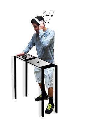
For this project we had to create anything we wanted as long as it was all made by us. We couldn't use anything from the internet. We had to create everything by ourselves. The first thing I did was write my name in 3D. First I drew it on a piece of paper and then scanned it in. I was going to pen tool it and do it that way but I couldn't close the lines without tracing backwards witch just messes up the path. I ended up tracing it with the brush tool then coloring it in. The first picture is my actual project but the second is me just messing around with it. The second project I did was editing a picture of one of my friends, making him look like a DJ. This wasn't too hard. I drew everything in Photoshop instead of printing it out drawing it then scanning it back in. I think it turned out pretty good. I really like the apple logo I did on the computer.
Actual Project^
Messing Around^
2nd Project^
Friday, March 15, 2013
Batesville Day Shirt Design
For this project we had to design a t-shirt for Batesville Day. Batesville day is a celebration of a local small town. I made this design by first starting with the ribbons. I first made a square using the rectangular marquee tool then using the warp function I curved the rectangle. After that I made two squares and cut triangles out of them. I placed them at the ends and added shadows and a gradient overlay to make it look more realistic. To get the type to curve with the ribbon I pen tooled the bottom of the ribbon curve and just used that as a text line. After I did the same thing with the bottom ribbon I tried to find pictures of apple butter since thats what they asked for. I found a picture of apple butter and an apple. I put the apple next t o it to make sure you knew it was apple butter. Then I just added a filter. I like how this turned out and would't change a thing.
Friday, March 1, 2013
Alphabet Project
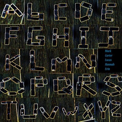
In this project we had to find or make the letters of the alphabet and take pictures of them. We then had to arrange them all on one picture. We did it by using our phones and ipods to create the letters. We took the pictures on one of the lunch tables. We weren't really inspired by anything. We just thought it would be cool to make the alphabet using something we use all the time. I think this project turned out really well and the only thing I would do over again would be to take more time to take the pictures and arrange the letters.
Wednesday, February 13, 2013
Revised Artist Statement for Chairs
In the project we had to redesign chairs while keeping them in 3D and make new shadows for them. The whole point of this was to learn how to create shadows and how to warp something to make it become apart of it. For chair 1 I used abstract paintings that I got off the internet and just warped them to fit the chair. I then added shadows using the burn and dodge tool. I also added a bigger shadow using drop shadow and outer glow. For chair 2 I used my old abstract art piece I did. I also added shadows using the burn and dodge tool. I also used the drop shadow effect and outer glow effect to make a bigger shadow. Nothing really inspired me. I just went for it and tried to make some really cool looking chairs. I really went for trying to make the chairs as colorful as possible. Also for chair 1 I really tried to go for a pattern of just crazy, cool abstract designs. I'm pretty happy with both of these projects. I think they both turned out really well. I liked this project because you could change something to make it look like what you wanted it to. Next time I would wait to merge all the layers so I can do some finishing touches.
Monday, February 11, 2013
Chair Project
For this project we had to change around the design of a chair and keep the look of a 3D figure. I approached this project by hoping to keep the shape of the chairs as intact as possible. The first one I did I used abstract art off the internet and the second one I did I used my splatter paint project from a while back. I used the burn and dodge tool to try and make some shadows on the chair and then I used the drop shadow and outer glow to make a shadow behind them. I am pretty happy with these chairs.

Monday, February 4, 2013
Monday, January 14, 2013
Subscribe to:
Comments (Atom)


