Friday, December 14, 2012

NAPP Tutorial 2

Horror Film Effect
For this project we were told to use NAPP tutorials to make things. I approached this project by following the guidelines pretty strictly. I did change some things at the end. I thought it looked a little dull so I added some color correction. I also added the movie title. I love how this turned out.

NAPP Tutorial 1

Explosive Tutorial
For this project we were told to make projects using the NAPP website tutorials. The first one I did was this one. It is an explosive effect. I approached this by adding my logo and just following the tutorial. I think it turned out pretty well. I really like the blurred particles, it gives it depth.

Friday, December 7, 2012

Card Design For Troops

For this project we had to make a card for troops. I approached this by making the squares with the letters then adding them to the background. And adding some cool effects. I didn't have much time to finish it up because I only had one class period. But I am pretty happy for how this turned out. It would have been a lot better if I could have made the boxes 3D using Cinema 4D. I also didn't have much time to make the snow covering the boxes look realistic.

Wednesday, December 5, 2012

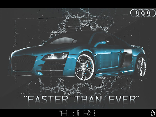
Audi R8 Ad

For this project we had to make our own ad for a product we liked. I love cars so I choose to do an Audi R8. I approached the project by getting a .png of an Audi then adding effects and other stuff. I am pretty happy for how this turned out. I really like the line effect I did to show the title of the graphic and my logo. I think it looks a lot more professional. 

Friday, November 30, 2012

Kaleidoscope Project

For this project I was told to make a kaleidoscope photo using Photoshop. We were given a tutorial on YouTube and following the tutorial made this project very easy. I approached this project by going out and taking the fist photo then doing the kaleidoscope on that. Then a got a picture of a Greek building and used that. I am very happy with how these turned out. I couldn't get either of the triangle to perfectly to 45 degrees. The grass and wall one is easy to cover up the lines but the Greek one was a lot harder. 


Monday, November 19, 2012

Photo-editing Site Reviews

PhotoFunia
PhotoFunia is not a very good site compared to the program Photoshop. You don't need any creativity to use this site. All you have to do is pick a cool effect from the lists of them and pick your photo. It's very easy to use. I think their target audience is your kids probably between the age of 10 and 13 who want to use this website to make "cool" photos to put on FaceBook.

Photo 505
Photo 505 is almost the exact same thing as Photofunia. They both give you certain effects that makes your photo look cool. There is no creativity needed. I think their target audience is the same as Photofunia, probably Tweens. 

PicMonkey
PicMonkey is a lot better than most of the other photo-editing websites. There is still not a lot of creativity needed to use it unlike Photoshop. The website lets you use certain tools like the tools in Photoshop like the burn tool, etc. It also gives you a choice to use a preset setting that lets you do some really cool things to the picture like "zombie-fying"it. I think the target audience is mainly teens. This is a pretty cool website.

Citrify
Citrify is another program that gives you a lot of freedom to do what you please. You can change the brightness, take off blemishes, and lots of other stuff. It also gives you effects like the "Obama Effect." And you can also add stickers of lips, hair, and other stuff. This is a lot easier to use than Photoshop but it doesn't give you nearly as much freedom. I think their main target audience is Teens. 

Wednesday, November 14, 2012

Inside Out Project

For this project I was told to show the perspective of the inside and outside of something. I decided to use a model because even beautiful things can be made ugly. I approached this project by downloading a 3D skull pack and a models picture. I then warped the skull over the models face so it looked like it was her skull. Then I duplicated her face and erased one side of her face to show her skull. After I just changed the color of her eye and added a CC and effects behind her. I am very happy for how this turned out.

New Logo!

This is my new logo. I thought it looked a lot cleaner than the By Lucas text. I pentooled this in photoshop.

Friday, November 9, 2012

Marla Abstract Art Project

For this project we first watched a documentary about Marla. Marla was a very young artist that did abstract art that sold for a lot of money. After watching this documentary we were told to make our own abstract piece. To get a better splatter paint effect I went online and looked for splatter paint brushes for splatter paint. After I found some brushes I just went crazy and added lots of colors. My inspiration came from Jason Pollock and all of his crazy paintings.

Wednesday, October 24, 2012

Filtered Self-Portraits

In this project we were told to take pictures of ourselves and edit them using different filters. Then we had to put them into a 3x3 grid and put it in a picture frame. I approached this project by trying to make the middle picture stand out the most. I thought it would help see what the real picture looked like then compare it to the filtered pictures. My inspiration came from seeing other similar projects and seeing what I could do better. I'm very satisfied with my project. I think the frame really represents me because I love soccer. Also the by Lucas text below is going to be my signature from now on. :)


Friday, October 19, 2012

Visual Pun's

For this assignment we had to make visual puns. For example, when you think fruit punch you think juice but if you think about it literally then it sounds like your punching someone with fruit. I approached this project by making every picture as realistic as I could. I got inspiration from other visual puns I saw. I'm extremely satisfied with my Seafood pun. I took the most time on that. All the other ones aren't very good. I needed to find graphics packs that included cracks and other things but I couldn't find any.


Friday, September 28, 2012

15 Green Things

15 Green Things
In this project our teacher gave us 15 different pictures all the same shade of green. We were told to do whatever we want with the pictures to make a picture. I approached this project trying to create something cool with the picture of the arch's she gave us. I wanted to make it look 3D. I was inspired by one of the pictures my teacher showed me. The picture was of a bridge using the arch's and it looked really cool. I'm very satisfied with my work because I think the scene actually makes some sense.


Wednesday, September 19, 2012

Crazy Combo Project

For this project we had to fing animals on the internet and create our own animal using their different parts. I tried to approach this project with as much creativity as possible. I felt the more creative I would be the more special and unique my animal would be. I didn't have many inspirations but I think my main one was that my favorite animal is a lion. Thats why I decided to make it look some what like a lion. I am very satisfied with my work on this project. Instead of using the eraser tool like some people in my class I used the selection tools and the patch tool so I felt all of the selections were very clean.

Wednesday, September 5, 2012

Music Project

In this project we were given a .psd file which had people, music notes, lines, and tie-die in it. We were given directions to do certain things to them. Along the way we had a few choices so everyones was different. After we completed the first one we were to make another one changing up what we did. Then we were to make a choice of which one we like more. Personally I like my second one the most (the tie-die one). I approached it by trying to make the people and music notes stand out. I was inspired by having the freedom to do almost what ever we wanted to with the things she gave us. I am only satisfied with the second one I did. I think the graffiti one is way to busy and confusing. If I had to redo the graffiti one I would change the colors of the people to help make it stand out.

Second attempt--> 

First attempt-->

Introduction

Hello,
My name is Luke and I am a freshman in high school. On this blog I will be posting all my work that I do in my digital imaging class. I am pretty good with graphic design because I have a few programs at home including Photoshop CS6, Adobe Illustrator CS5, and Cinema 4D. The type of graphics stuff I like to do is work from scratch. I like making my own 3D text in Cinema 4D and doing what ever I want to do with it in Photoshop. I also really enjoy doing photo manipulations.  I also play lots of sports including soccer, skiing, and swimming. I hope you enjoy my projects.